01629 823692
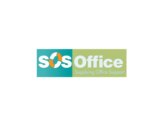
SOS Office
This young company needed to make much greater use of their logo, which was previously just text-based in a common font. Picking out the "SOS" element and introducing the life ring gives the whole package an identity, whilst uniting the elements and echoing the supportive/rescuing nature of their work.
The green and blue colour scheme (used throughout their company literature and website) extends the metaphor and leaves a fresh and distinctive impression.